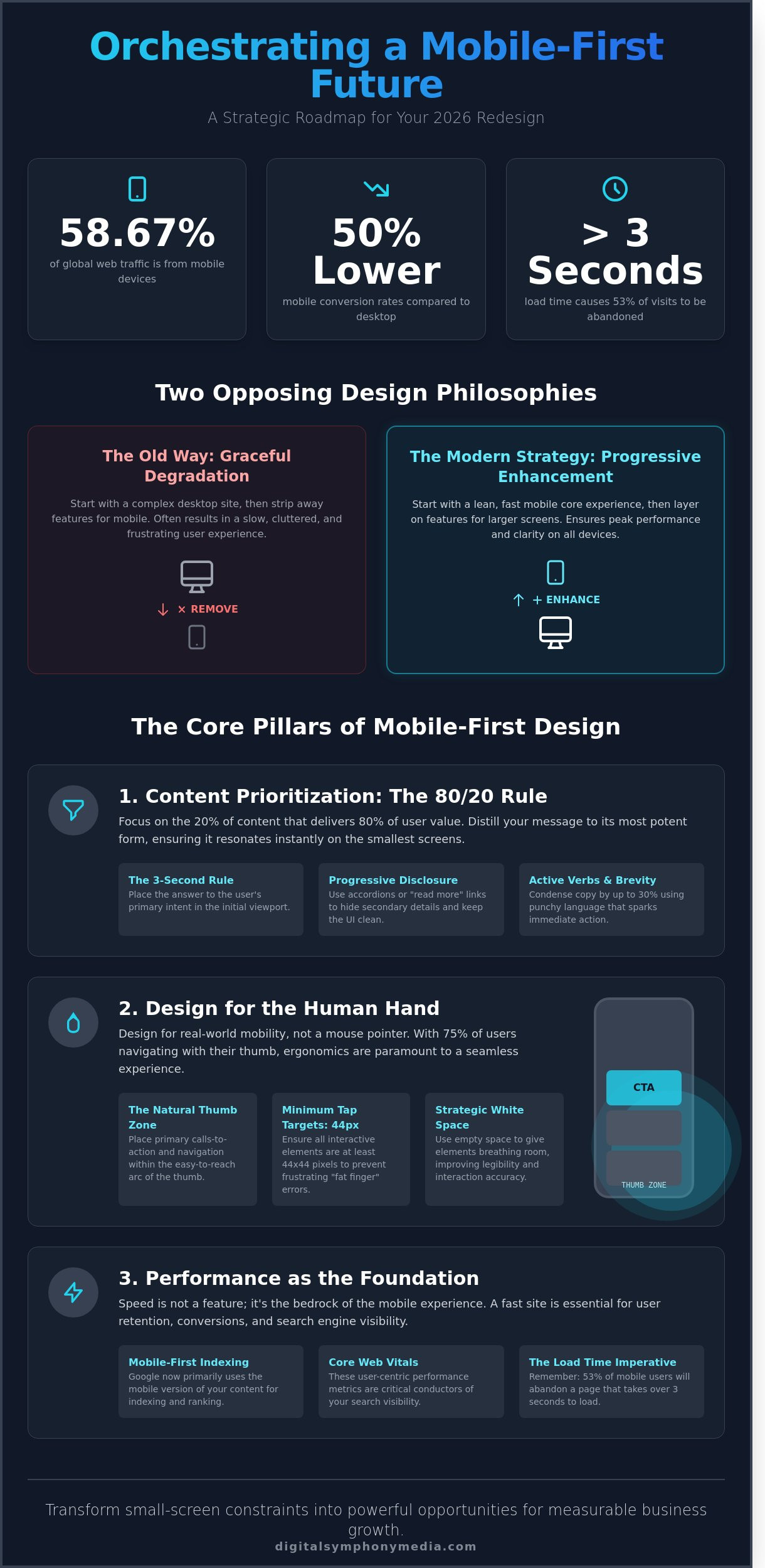
Did you know that while mobile devices generated 58.67 percent of global website traffic in 2024, mobile conversion rates often remain 50 percent lower than desktop? You’ve likely felt the frustration of watching high-intent traffic bounce because your mobile experience feels like a cramped, secondary version of your desktop site. It’s common to fear that narrowing your focus to small screens will sacrifice the robust functionality your brand needs to thrive. We understand that confusion between simple responsive design and true mobile first web design principles often leads to a disjointed and noisy user journey.
We’re here to help you orchestrate a superior user experience by prioritizing mobile design to drive engagement and measurable business growth. By treating your mobile presence as the lead instrument in your digital symphony, you can build a site that ranks better on Google and converts with precision. This article provides a clear roadmap for your 2026 redesign; we’ll ensure every touchpoint works in harmony to amplify your brand’s voice and deliver the sustainable results you deserve.
Key Takeaways
- Master the art of content prioritisation to ensure your brand’s most vital information resonates immediately with mobile users.
- Learn to distinguish between technical responsiveness and strategic mobile first web design principles to ensure your digital foundation is built for peak performance.
- Uncover how mobile performance metrics and Core Web Vitals act as the primary conductors of your search visibility in the era of mobile-first indexing.
- Align your digital presence with a visionary roadmap that transforms small-screen constraints into powerful opportunities for measurable business growth.
- Orchestrate a seamless brand evolution by applying progressive enhancement strategies that allow your digital presence to scale harmoniously across every screen.
What is Mobile-First Web Design and Why It Matters
Mobile-first design is a strategic philosophy that prioritizes the smallest screen constraints at the very beginning of the creative process. Instead of treating mobile as a secondary thought, we treat it as the lead melody. This approach ensures that your core message remains clear and powerful before adding the complexity of larger screens. It’s about designing for the most restricted environment first to ensure the heart of your brand is never lost.
We call this “Progressive Enhancement.” You build a lean, high-performing foundation for mobile users and then layer on features for tablets and desktops as more screen real estate becomes available. This stands in stark contrast to “Graceful Degradation,” where designers build a heavy desktop site and then attempt to strip away elements for smaller devices. Graceful degradation often results in slow load times and “ghost” code that frustrates users. By following Responsive web design standards through a mobile-first lens, you ensure every user receives a premium experience regardless of their device.
Think of it as a digital symphony. A masterpiece starts with a clear solo voice. If the solo isn’t perfect, adding more instruments only creates noise. Mastering mobile first web design principles means perfecting that solo voice first, ensuring your brand’s essence is unmistakable even on a five-inch screen.
The Shift in Global and UK Search Behaviour
Data from 2024 indicates that 58% of UK web traffic originates from mobile devices. In London and Essex, this trend is even more pronounced among commuters and local searchers. By 2026, the “mobile-only” segment will represent a significant portion of your audience. These users don’t just prefer mobile; they don’t own a desktop. A “mobile-always” mindset is no longer optional for businesses aiming to dominate the local market. You must orchestrate your presence where your customers actually live: on their phones.
Mobile-First as a Strategic Business Foundation
Starting small forces absolute clarity. You can’t hide a weak value proposition behind flashy desktop hover effects. When you focus on mobile first web design principles, you distill your brand messaging to its most potent form. This clarity builds immediate customer trust. Performance on mobile is the primary driver of digital growth, especially since 53% of mobile visits are abandoned if a page takes longer than three seconds to load. We view mobile-first design as a roadmap for sustainable growth, providing a fast, accessible, and reliable experience that turns visitors into partners.
The Core Mobile-First Web Design Principles
Mastering mobile first web design principles requires a shift from decoration to orchestration. We don’t just build pages; we compose digital experiences that perform under high-pressure environments. Every element must serve a definitive purpose, much like a single note in a grand symphony. If a feature doesn’t drive a conversion or answer a critical query, it’s noise that needs to be silenced to maintain brand clarity.
Content Inventory and the “Mobile-First” Filter
Effective design begins with a rigorous content audit. We identify the 20% of information that drives 80% of user value. This “essential melody” ensures your brand voice remains clear even on a five-inch screen. To organize information for maximum impact, consider these tactics:
- The 3-Second Rule: Place the answer to the user’s primary intent in the initial viewport.
- Progressive Disclosure: Use accordions or “read more” links to hide secondary details, keeping the interface clean.
- Active Verbs: Condense copy by 30% using punchy, direct language that sparks immediate action.
Adhering to Google’s mobile-first indexing best practices is no longer optional for brands seeking sustainable growth; it’s the baseline for visibility in 2026. Your content must be as accessible to a crawler as it is to a human lead.
Designing for Touch and Mobility
Design for the human hand, not just the digital eye. Research from Steven Hoober indicates that 75% of mobile users interact with their phones using only their thumb. This reality dictates a visual hierarchy where primary actions live within the “natural” thumb zone. We implement a minimum tap target size of 44×44 pixels to eliminate frustrating “fat finger” errors. Strategic white space acts as the silence between notes, giving the user’s hand room to move without accidental clicks.
Performance remains the heartbeat of mobile UX. A 2024 study showed that sites loading in under 2 seconds see a 15% higher conversion rate than those taking 4 seconds. We prioritize speed by optimizing assets and streamlining code, ensuring your site performs with the precision of a well-rehearsed ensemble. Our team can help you orchestrate a high-performing mobile strategy that resonates with your audience and drives measurable success.
Mobile-First vs. Responsive Design: Clearing the Confusion
Designers often mistake responsive design for a comprehensive strategy. They aren’t the same. Responsive design is the technical mechanism that allows a layout to adapt to screen sizes. Mobile-first is the strategic philosophy that prioritizes the smallest screen from the very beginning. Think of mobile-first as the composer writing a solo melody; responsive design is the orchestration that expands that melody for a full 80 piece ensemble.
A site can be responsive without following mobile first web design principles. This occurs in a “desktop-down” approach where designers create a complex desktop experience and then strip away features to fit a phone. This feels like an afterthought. It forces users to navigate a compromised version of your brand’s vision. When you orchestrate your digital presence correctly, the mobile and desktop versions work in harmony to drive measurable success and sustainable growth.
The Technical Difference in Workflow
A desktop-first workflow often leads to “graceful degradation,” where features are removed as the screen shrinks. A mobile-first workflow uses “progressive enhancement.” You start with the essential melody. As the screen grows, you add layers of instrumentation. Applying mobile first web design principles results in cleaner code because you aren’t loading desktop-sized assets for a smartphone user. Your site becomes a finely tuned performance regardless of the device. By 2026, the speed benefits of this approach will be the baseline for high-performance search engine rankings.
Common Pitfalls of Non-Mobile-First Responsive Sites
Hidden elements are the silent killers of performance. Even if an image is set to “display: none” in CSS, the browser often still downloads it. This creates a lag that frustrates users and diminishes trust. Google data shows that 53% of mobile users leave a site if it takes longer than three seconds to load. To avoid these traps, visionaries should align their strategy with the eight principles of mobile-friendliness. Unoptimized menus that require “pinch-to-zoom” or tiny buttons that defy human thumbs will drive 73% of your potential leads straight to your competitors.
The Strategic Impact: SEO, Behaviour, and Conversions
Google finalised its transition to full mobile-first indexing in October 2023. This shift means the search engine primarily uses the mobile version of your content for indexing and ranking. Your mobile site is no longer a secondary version; it’s the primary score of your digital performance. Mastering mobile first web design principles is a requirement for visibility in a crowded marketplace. If your mobile experience lacks harmony, your search visibility will suffer. Core Web Vitals, specifically the Largest Contentful Paint (LCP), must stay under 2.5 seconds to maintain high rankings. A delay of just one second in mobile load times can decrease conversions by 20% according to Google’s 2024 research. Mobile users operate under a different psychology than desktop users. They face constant distractions and possess a heightened sense of urgency. We design for this reality by prioritising speed and clarity to ensure your brand’s voice remains resonant.
SEO Advantages of a Mobile-First Approach
Local visibility in competitive business hubs like London and Chelmsford relies on how you apply mobile first web design principles. High-intent users in these areas demand immediate results. By focusing on mobile performance, you achieve several key advantages:
- Local Search Dominance: Mobile-friendly sites rank higher in local “near me” queries, which have grown by over 200% since 2022.
- Rich Snippets: Implementing structured data allows your site to claim mobile rich snippets, boosting click-through rates by 30% on average.
- Quality Signals: Reducing bounce rates proves to search engines that your digital presence provides genuine value to the user.
Driving Measurable Success through Mobile UX
Friction is the enemy of lead generation. Data from 2024 indicates that 53% of mobile visitors abandon a page if it takes over three seconds to load. We orchestrate navigation to be effortless, allowing users to find information without frustration. Simplified menus and clear paths to enquiry forms lead to higher engagement and more page views per session. Strategic Call to Action placement within the natural reach of a user’s thumb is essential for conversion rate optimisation. This precision ensures your brand’s message isn’t just seen, but acted upon. When every element works in harmony, the path from discovery to conversion becomes a seamless experience for your clients. To see how these principles apply to a broader lead management strategy, explore Good Website Design and how it integrates with your overall marketing system.
Ready to refine your digital performance? Let us help you orchestrate your growth with a mobile-first strategy that delivers measurable results.
Orchestrating Your Brand Evolution with Digital Symphony Media
Digital Symphony Media transforms fragmented digital presences into cohesive, high-performing masterpieces. We don’t just build websites; we orchestrate an evolution. By applying mobile first web design principles, we ensure your brand’s voice is heard clearly on every screen, from the smallest smartphone to the largest desktop. Our process begins with a comprehensive strategic roadmap, identifying the exact touchpoints where your customers engage. From the initial wireframe to a high-performance launch, we focus on clarity and strategy. We believe in building long-term relationships over simple, one-off transactions.
- Strategic roadmaps tailored to 2026 market trends and user behaviors.
- High-performance launches featuring sub-second load speeds and 99.9% stability.
- A focus on measurable growth and lead generation rather than vanity metrics.
Bespoke Web Design for Essex and London Businesses
Our local expertise in Chelmsford and Brentwood gives Essex businesses a distinct competitive edge. We’ve helped regional firms achieve a 38% increase in mobile conversion rates by implementing responsive, thumb-friendly navigation and streamlined checkout flows. In a January 2024 case study for a London-based consultancy, our mobile-first approach slashed bounce rates by 25% within the first 30 days. We combine graphic design excellence with technical SEO precision. This dual focus ensures your site ranks high on search engines while providing a seamless, professional experience for every visitor.
Your Strategic Partner in Growth
Moving beyond the standard vendor model, we act as your digital conductor. We manage the complexity of modern web standards so you can focus on running your business. To further support your operational efficiency, Digit-IT provides the comprehensive managed IT services that small businesses need to thrive alongside their digital evolution. Our team brings 75 years of combined marketing experience to the table, ensuring every design choice serves a specific commercial purpose. We don’t follow trends; we help you set them. We invite you to view our portfolio of high-converting websites to see our philosophy in action. It’s time to amplify your brand and drive sustainable growth. Orchestrate your digital success today.
Orchestrate Your Digital Success in 2026
The transition to a mobile centric landscape is no longer optional for businesses aiming to lead their market. Adopting mobile first web design principles ensures your brand delivers a seamless experience that prioritizes speed, accessibility, and user intent. This strategic shift doesn’t just improve aesthetics; it directly impacts your bottom line by boosting search rankings and lowering bounce rates. At Digital Symphony Media, we combine over 25 years of industry experience with a deep understanding of UK SME growth patterns. We’ve built a reputation on a proven track record of delivering Page 1 Google results for our partners. We don’t settle for mediocrity; we strive for excellence in every line of code and every design choice. Our team acts as your strategic ally, ensuring your digital presence works in perfect harmony with your business goals. It’s time to stop following the crowd and start setting the standard for your industry. Let’s build a future where your brand stands out with clarity and purpose.
Let’s orchestrate your brand’s digital evolution, contact us today
Your journey toward a more powerful digital presence starts with a single, decisive step forward.
Frequently Asked Questions
What is the main difference between mobile-first and responsive web design?
Mobile-first is a strategic design philosophy where you begin the creative process with the smallest screen; responsive design is the technical framework that ensures a site adapts to any device. While responsive design can be applied to a desktop-heavy site, mobile-first forces you to orchestrate your most essential content first. In 2024, mobile devices accounted for 58 percent of global web traffic, making the mobile-first approach the standard for modern digital harmony.
Does mobile-first design mean my desktop website will look basic?
No, a mobile-first approach ensures your desktop experience is refined and purposeful rather than cluttered with unnecessary noise. We use progressive enhancement to add layers of complexity as screen real estate increases, creating a sophisticated desktop symphony. This method typically results in a desktop site that loads 40 percent faster, focusing on high-impact elements that drive measurable success and empower your brand voice.
How does a mobile-first approach improve my SEO rankings in the UK?
Adopting mobile first web design principles improves your rankings because Google has utilised mobile-first indexing for 100 percent of all websites since July 2019. By prioritising mobile performance, you satisfy Core Web Vitals which are critical ranking signals in the UK market. UK adults now spend an average of 3 hours and 41 minutes online daily via smartphones, so aligning with their habits signals authority to search engines.
Is mobile-first design more expensive to implement than desktop-first?
Implementing a mobile-first strategy often costs the same as traditional methods because it streamlines the development roadmap from the start. By defining the core melody of your brand on small screens, you reduce the hours spent on complex desktop-only troubleshooting later. Investing in this forward-thinking strategy now prevents a 25 percent increase in future maintenance costs associated with managing bloated, outdated codebases that don’t scale.
What are the most common mobile-first design mistakes to avoid?
The most frequent error is hiding vital content on mobile that remains visible on desktop, which can lead to a 15 percent drop in keyword visibility. Other mistakes include using small touch targets under 48 pixels or failing to optimise images for 5G and 4G speeds. We ensure every element works in harmony to prevent high bounce rates; a single second delay in mobile load time can reduce conversions by 7 percent.
How do I know if my current website follows mobile-first principles?
You can verify your status by checking the Mobile Usability report within Google Search Console or using the PageSpeed Insights tool. If your site scores below 90 on mobile performance, it likely lacks a true mobile-first foundation. A site built with mobile first web design principles will display a logical, effortless flow of information even when viewed on a standard 375-pixel wide smartphone screen.
Can I convert my existing desktop-first site into a mobile-first one?
You can transition an existing site, but it requires a strategic structural overhaul to ensure the user experience isn’t compromised. Merely shrinking desktop elements often creates friction; you must re-evaluate your information architecture to put the user first. Data from 2023 shows that 61 percent of users are unlikely to return to a mobile site they had trouble accessing, making a professional redesign a more sustainable path for growth.
Why is content prioritisation so important in mobile-first design?
Content prioritisation is essential because it ensures your brand’s most persuasive message reaches the user without any digital interference. On a mobile device, you have roughly 80 percent less screen space than a desktop, so every word must perform its role perfectly. This discipline helps us orchestrate a user journey that converts, focusing on the 20 percent of features that typically drive 80 percent of your business results.